
With Edgemesh 3.3 we've updated the way metrics are displayed - focusing on delivering the right data, right away. Edgemesh 3.3 metrics are more than 400x faster than 3.2, yet deliver a much deeper level of insight.
Fast/Average/Slow
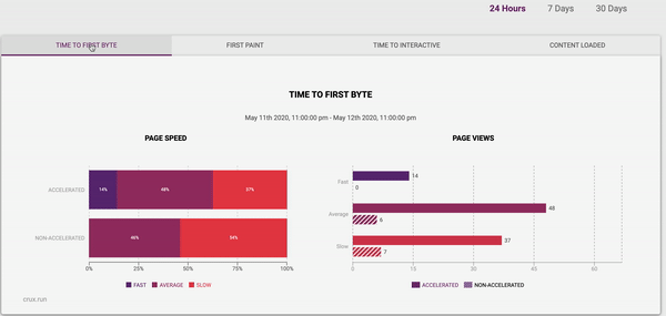
Our first section of metrics in 3.3 is called the Fast/Average/Slow User Experience set. These metrics provide a simple breakdown of how your site ranks according to industry speed benchmarks - similar to Google's own Chrome Real User eXperience (CRuX) ranking.
Unlike a single metric, like the "average web speed", this category based breakdown helps you see the whole picture. As an example, when we looked at Edgemesh.com we were surprised to discover that ~5.8% of our customers had a "Slow" Time to First byte (server response) - despite our median TTFB being well below 200ms.
The 4 Main Metrics:
Edgemesh captures the full spectrum of Real User Metrics, but for the UI we have focused on the 4 key metrics that we find drive business impact:
- Time to First Byte: This is the time it takes for the server (Shopify, Magento, Cloudflare etc) to respond with the very first byte of data. This metric is important as a slow time to first byte can dramatically impact the rest of the user experience.
- Time to First Paint: This is the time it takes for a screen to go from a blank page, to some painted content. The First Paint metric answers the key use question: "Is this website loading?". First Paint times have a direct impact on Bail ratios - which is the percentage of users who abandon you site before the any core content is loaded, as well as Bounce and Search rank.
- Time to interactive: The Time to Interactive is how long it takes before the user can interact (scroll, click etc.) with your site. At Edgemesh, we've consistently found Time to Interactive to be the most impactful metric on Conversion Rate.
- Content Loaded: This metric measures when the all of the core content for the page has loaded. Essentially this is the last (meaningful) performance benchmark - with the page now fully loaded from the user's standpoint.
Each metric has its own Fast/Slow breakpoints, based on industry benchmarks.
- Time to First Byte: Experiences less than 100ms are considered Fast. Experience that took more than 500 ms are considered Slow.
- Time to First Paint: Experiences less than 1 second are considered Fast. Experience that took more than 2 seconds is considered Slow.
- Time to interactive: Experiences less than 1.5 seconds are considered Fast. Experience that took more than 2.5 seconds is considered Slow.
- Content Loaded: Experiences less than 2 seconds are considered Fast. Experience that took more than 3 seconds is considered Slow
Summary View
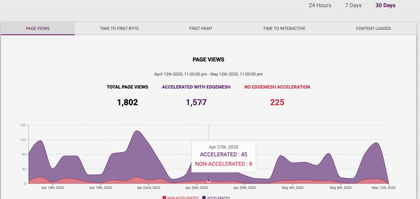
The Summary view aggregates all page-views for either the past 24 hours , 7 days or 30 days (date selector in the upper right).
You may notice that as the page progresses from First Byte> First Paint > Interactive > Content Loaded ; Edgemesh accelerated users have fewer and fewer "Slow" user experiences and more "Fast" user experiences.
Time Series Analysis
Want to dig a little deeper? You can view these metrics as a time series to identify trends and impacts on site updates.
You can also quickly see how your traffic rates impact performance metrics by easily switching between metric views. As with the summary views, you can expend the analytics to 7 or 30 days (90 and 360 days views available for Edgemesh Enterprise).
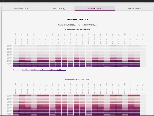
Heatmap Analytics
This is it, the full enchilada. If you're ready to go full nerd - we've got you covered. The Heatmap view show full distribution of the metric under study, allowing you to identify outliers and see trends.
Each column in the heatmap corresponds to a time band , and each row corresponds to a bucket of latency.
For example, the buckets are sized at 500 millisecond increments up to a maximum latency of 7000 milliseconds (7 seconds). Samples which took longer than 7 seconds remain in the top bucket - which is anything more the 7s.
The heatmap also contains a color palette to help denote hotspots. Buckets of higher latency move from purple to red, allowing you to quickly identify where latency hotspots are.


