

Wondering how to upload high-quality images without slowing down your page load time? Or how you could compress your images without them losing quality? With next-gen image formats, you can do both—and more.
In this guide, we’ll cover what next-gen images are, how they vary, how to convert to next-gen images—and how to serve next-gen images to your visitors.
What Are Next-Gen Image Formats?
Next-gen image formats are web-optimized image file formats that retain the quality of the original image when compressed. Next-gen, short for next generation, offers an image format that consumes less network data, resulting in faster load times. Due to its advanced compression capabilities, it’s now easier for mobile and tablet devices to display high-quality images without sacrificing page size and speed.
Related → 10 Website Optimization Tips To Speed Up Your Website
How Does Serving Images In Next-Gen Affect Your Website Performance?
First, it’s all about speed.
- How fast your website loads
- How fast your content loads
- How fast your server responds to the browser’s request
This sums up the idea that your overall website performance depends on how fast it can handle user interactions. A significant factor that can make or break your website is the image size and quality.
In most instances, you’re split between:
- High-quality images with large file size = poor page load time
- Low-quality images with small file size = great page load time
With either, users get a bad page experience.
Serving your images in next-gen solves both problems. Google recommends next-gen image formats due to their image compression capabilities. For example, if you run your website through Google’s PageSpeed Insights, you’ll get this suggestion:

Related → What Is Page Speed? [+Why It’s Important for SEO]
Types of Next-Gen Image Formats
There are two types of next-gen image formats:
- AVIF
- WebP
AVIF
AVIF, short for AV1 Image File Format, is an image file format that compresses images into smaller sizes while retaining their image quality. The AVIF is designed with a lossless image compression capability that far superseded the WebP.
However, one major downside to AVIF is its limited compatibility with most browsers.
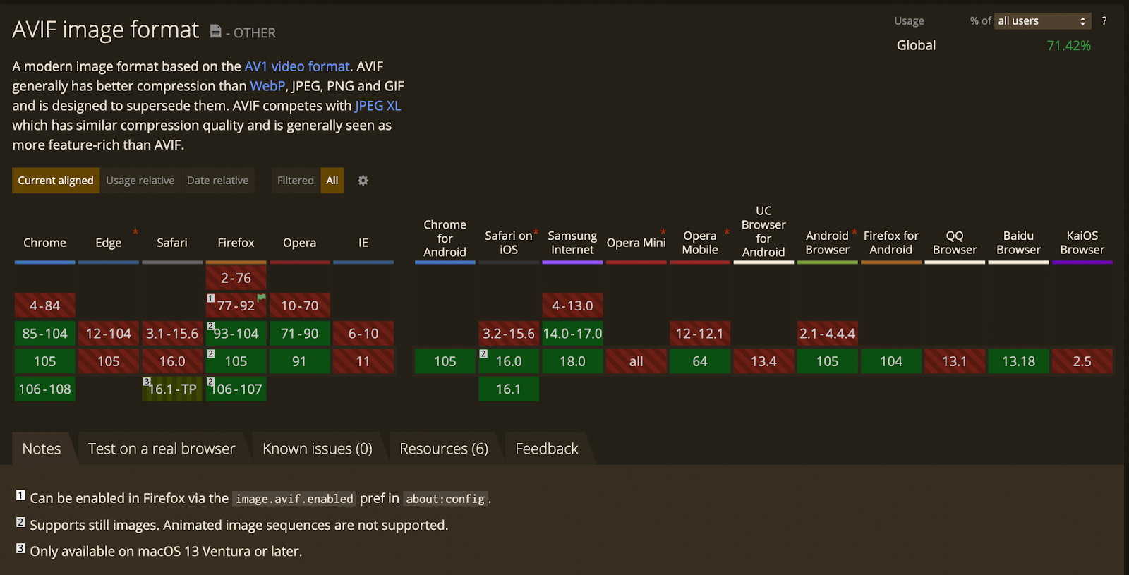
[Via CanIUse]
WebP
WebP stands for Web Picture Format, an image file format developed by Google that provides lossy and lossless compression for web images.
In comparison with other images formats:
- WebP lossless images are 26% smaller in size compared to PNGs [*].
- WebP lossy images are 25-34% smaller than comparable JPEG images at equivalent SSIM quality index [*].
However, lossless and lossy WebP images each have their best use case.
- Lossless compression is best suited for images displayed in multiple screen sizes—for example, your website background image on desktop, tablet, and mobile devices.
- Lossy compression is suitable for images with fixed dimensions (height x width). For example, when your blog post’s author image has a fixed dimension on every device.
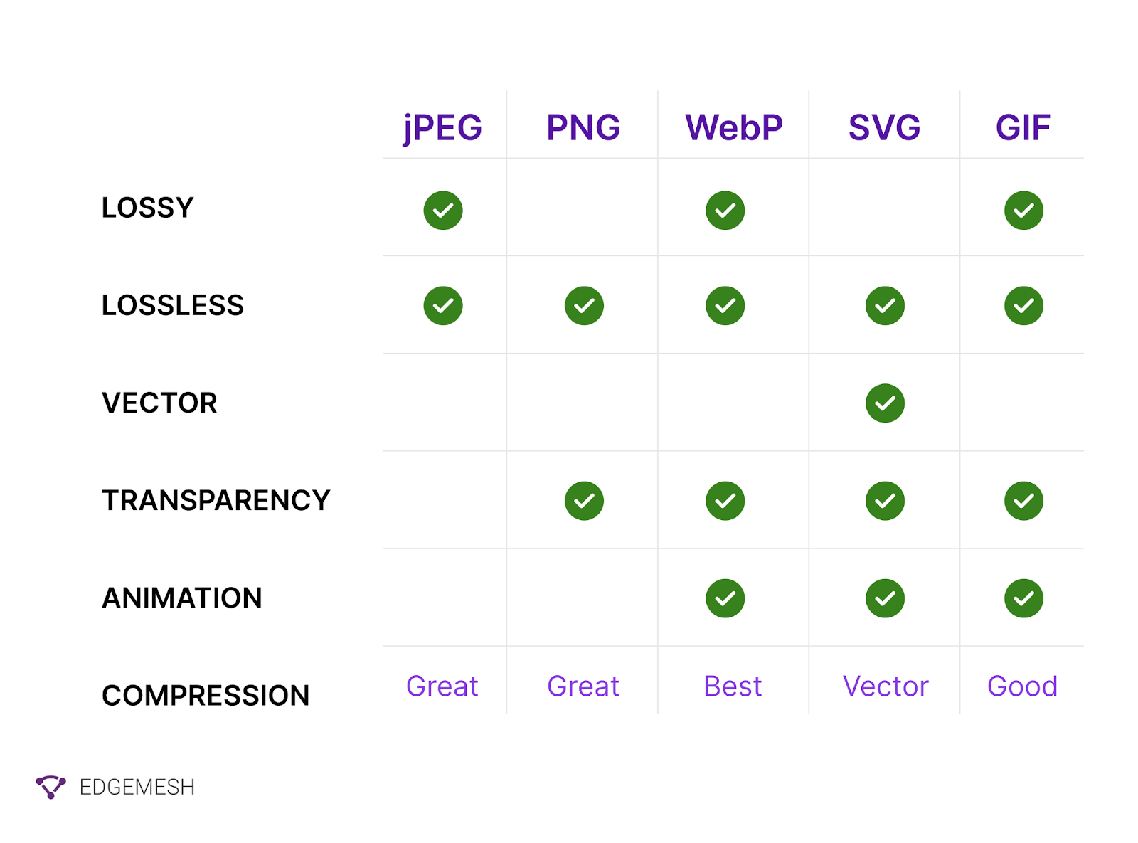
This also allows WebP to support all image types, including animations and alpha channel transparency.
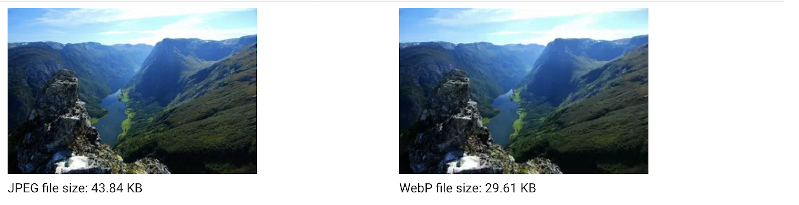
Look at the comparison below between these JPEG and WebP images:
Via Google WebP

In terms of browser compatibility, WebP works well with most major browsers (based on the latest update) [*].

Unlike other image formats such as PNG, SVG, and JPEG, next-gen formats like WebP and AVIF offer a high level of image quality with less data.
Note: Based on browser compatibility issues, we recommend using WebP image formats instead of AVIF.
Related → What Is Lazy Loading Website Images? [+Benefits]
How To Convert Images to WebP
Several online tools can help you convert your images to WebP in a matter of seconds. We recommend the below.
- Use the cwebp command-line tool
The cwebp is best used to convert single JPEG or PNG images. Plus, you get to specify the quality level of each image during conversion: From 0 (worst) to 100 (best).
- To convert a single file:
cwebp images/flower.jpg -o images/flower.webp
- To convert a single file with a quality level of 50 (medium):
cwebp -q 50 images/flower.jpg -o images/flower.webp
- To convert all files in a directory:
for file in images/*; do cwebp "$file" -o "${file%.*}.webp"; done
Via Google Web Dev.
- Use the Imagemin WebP Plugin
This plugin is often the best choice, especially if your project uses build tools or scripts like Gulp or Grunt, WebPack,etc.
To use Imagemin, you’ll have to add ~10 lines of code to either your build script or to the configuration file of the build tool.
const imagemin = require('imagemin');
const imageminWebp = require('imagemin-webp');
imagemin(['images/*'], {
destination: 'compressed_images',
plugins: [imageminWebp({quality: 50})]
}).then(() => {
console.log('Done!');
});
- Use Google’s Squoosh Tool
Squoosh is an app built by Google to help you compress, resize, and convert images. The tool also gives you a slider that lets you compare the differences between images.
Here’s how to use Squoosh:
- Visit squoosh.app
- Drop or paste your images in the box on the page.

- On the next page, set your preferences from the drop-down in the bottom left corner.
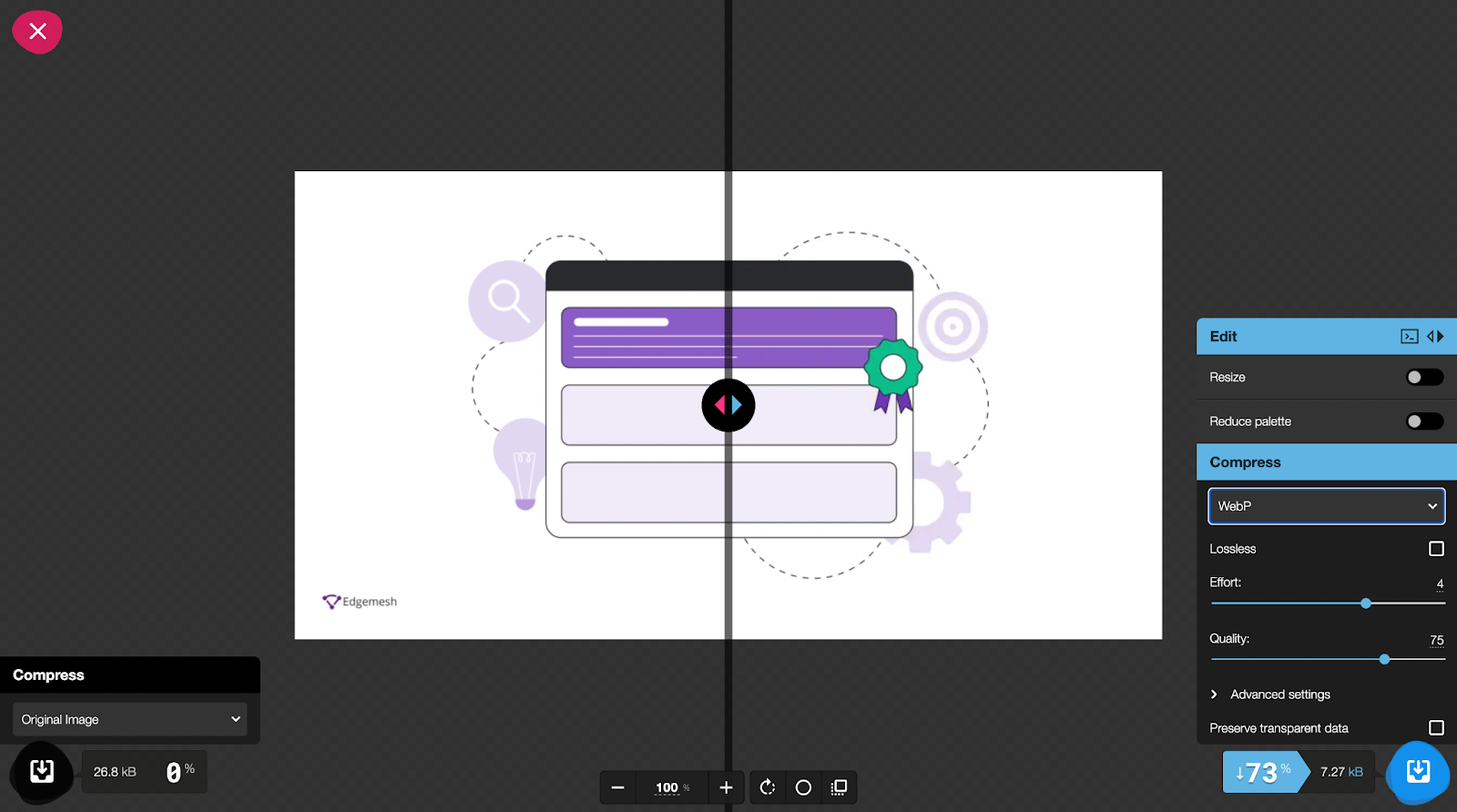
- The above image shows that the original image was 26.8kb (jpeg). But when compressed and converted into WebP, it’s now 7.27kb (WebP) — a 73% difference.
When using Squoosh, the simple settings are enough to get you by, but you can also use the advanced settings for a customized image.
Some other plugins that can help you convert your images to WebP include:
- Smush (pro version only)
- WebP Express
- Shortpixel Image Converter
- EWWW
How To Serve Images in Next-Gen Formats: 3 Ways
Converting your images to next-gen formats like WebP and AVIF is easy. Serving the images is a different story. Since some browsers don’t support formats like WebP, making WebP your default image format isn’t possible—or recommended. Fortunately, there are methods that can help you detect if the user’s browsers support WebP or not.
1. Modify Your .htaccess File
Note: Use this method only if you’re an expert web developer or know your way around editing your site code.
The .htaccess (hypertext access) file is mainly used for configuring your website server. Among its functions is an option to determine how to serve WebP images.
Here’s how to do it:
- Ensure your images are backed up in JPG, PNG, or GIF
- Then, place your images in the WebP version in the same folder as those in other widely supported formats
- Now input the following GitHub code in your .htaccess file
<IfModule mod_rewrite.c>
RewriteEngine On
# Check if browser supports WebP images
RewriteCond %{HTTP_ACCEPT} image/webp
# Check if WebP replacement image exists
RewriteCond %{DOCUMENT_ROOT}/$1.webp -f
# Serve WebP image instead
RewriteRule (.+)\.(jpe?g|png|gif)$ $1.webp [T=image/webp,E=REQUEST_image]
</IfModule>
<IfModule mod_headers.c>
# Vary: Accept for all the requests to jpeg, png and gif
Header append Vary Accept env=REQUEST_image
</IfModule>
<IfModule mod_mime.c>
AddType image/webp .webp
</IfModule>
[Source: Vincent Orbak on WebP images with htaccess]
2. Use the HTML5 <picture> Element
Another great way to serve WebP images is to rely on the user’s browser to choose the best image format to display. One advantage of this method is the built-in image backup that lets browsers without WebP compatibility choose other image formats.
Here’s how to do it:
- Ideally, your image source in your HTML reads like this:
<img src="bird.jpg" alt="">
- Using the picture element, you’ll change it to this:
<picture>
<source type="image/webp" srcset="bird.webp">
<source type="image/jpeg" srcset="bird.jpg">
<img src="bird.jpg" alt="">
</picture>
- Alternatively, you can set custom width and height to avoid issues of layout shift.
<picture>
<source srcset=”bird.webp” type=image/webp”>
<source srcset=”bird.jpg” type=image/jpeg”>
<imgsrc=”image.jpg” alt=”your image here” width=”75” height=”75”>
</picture>
3. Leverage Javascript
Javascript offers a great way to detect compatible browsers with WebP image formats. And a common library for handling this type of events is Modernizr.
The library helps test which native CSS3 and HTML5 features a user’s browser has to offer. For example, to detect browsers that support:
WebP
CSS
.no-webp .box { color: red; }
.webp .box { color: green; }
JS
Modernizr.on('webp', function(result) {
if (result) {
// supported
} else {
// not-supported
}
});
WebP animation
CSS
.no-webpanimation .box { color: red; }
.webpanimation .box { color: green; }
JS
Modernizr.on('webpanimation', function(result) {
if (result) {
// supported
} else {
// not-supported
}
});
WebP Alpha (Transparency)
CSS
.no-webpalpha .box { color: red; }
.webpalpha .box { color: green; }
JS
Modernizr.on('webpalpha', function(result) {
if (result) {
// supported
} else {
// not-supported
}
});
WebP Lossless
CSS
.no-webplossless,webp-lossless .box { color: red; }
.webplossless,webp-lossless .box { color: green; }
JS
Modernizr.on('webplossless,webp-lossless', function(result) {
if (result) {
// supported
} else {
// not-supported
}
});
Start Optimizing Your Website Performance With Next-gen Images Now
Poorly optimized images kill your business in two ways: They slow down your website and they affect your brand’s image.
Visitors landing on your website want a fast, seamless experience. The longest they’ll wait is 3 seconds—they start leaving after that. The more visitors bounce from your website, the lower your traffic, conversions, and overall sales.
Next, the quality of the images on your website depicts your brand’s image. If this image has poor quality, visitors will have a bad perception of your skills or products, which affects your bottom line. So you can’t have a fast website and poor image quality—or vice-versa. You need both.
The tools and methods explained here will help you optimize your images. But a better option is switching to a one-click solution. With a single line of code, Edgemesh’s head (ache)-less solution optimizes your overall website performance. Plus, you’ll see significant results in a matter of days—not months.
We call it speed without bumps.
Read Case Study → How Edgemesh Helps Kitsch Convert More Users With A Faster Shopify Store
Bonus tip → 99% of Edgemesh customers self onboard via the Edgemesh portal. Installation generally takes about 5 minutes and involves adding a line of code to the header and a single JavaScript file to the root.
The ROI of fast websites is increased conversion rates. We know this because our clients see an average increase in conversion rate of up to 20% simply because we took this statement to heart.
Your conversion rates drop by 4-7% for every additional second your website delays. The choice is yours.
Ready to improve your website performance in 5 minutes? → Book a demo now!


