
Giving users a great experience while visiting your website is all about images. Did you know that 65% of the human population are visual learners? But what happens after uploading images on your website, and your user experience still doesn’t improve? One simple cause for this is that your image is taking too long to load.
What do you do if your images take too long to load?
You can compress your images to reduce the workload on the server to improve the response time to the browser—but you can do a lot more.
Start lazy loading your images.
Lazy loading images involve deferring an image’s loading process during the loading event until it’s visible in the user's viewport. Today’s article will discuss an excellent way to lazy load images on your website and the best practices you need to get the best results. Let’s go!
What Is Lazy Loading Images?
Lazy loading of images, or iframes, is based on serving users only when they need them. Doing it this way eliminates the need for browsers to load all images during a loading event.
Lazy loading is typically done for images below the fold. To make this possible, lazy loading employs JavaScript to analyze the scrolling pattern of content along with those that fall within the user's viewport. Once it detects images in a user’s viewport, the image then begins to load.
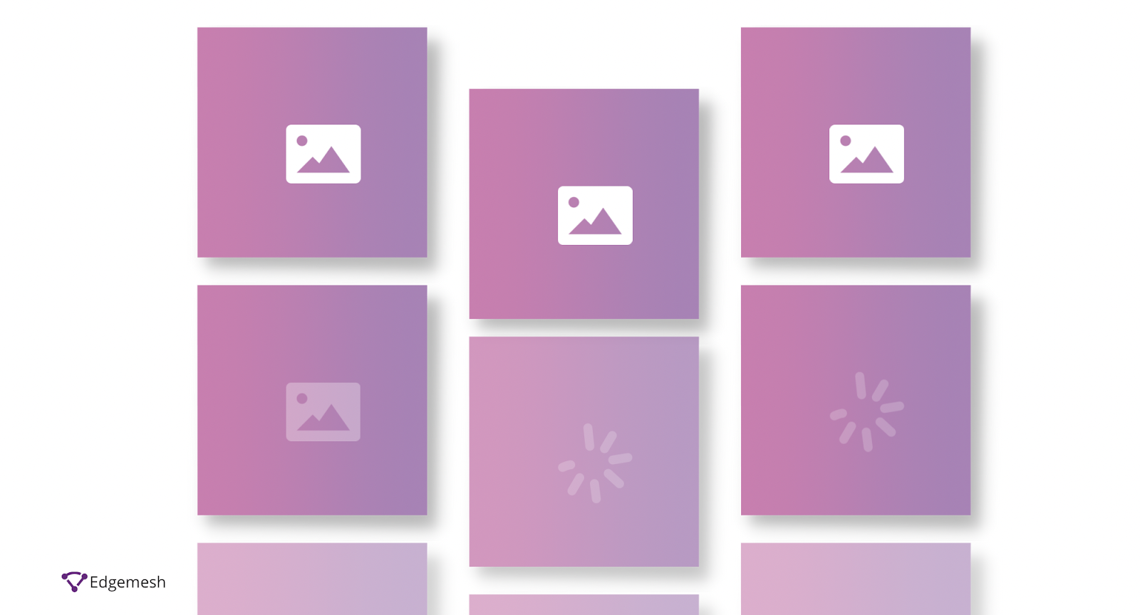
Although many websites lazy load images, it’s hardly noticeable except those with many images. A quick example is Unsplash.com. While browsing the website, images above the fold load immediately, but images below the fold quickly fill up their placeholders as you scroll down.


Placeholders are pretty standard among websites with many images. The placeholders avoid a common web performance problem called CLS—Cumulative Layout Shift.
Related: What Is Cumulative Layout Shift?
Using placeholders with the same length and height as the original image can avoid the images shifting when they load. The only difference to your placeholder is the mode at which you want it to load—in the case of Unsplash.com, the blurred effect is the technique used. Several other techniques are used to lazy load images, and we’ll talk about them shortly.
3 Benefits of Lazy Loading Images
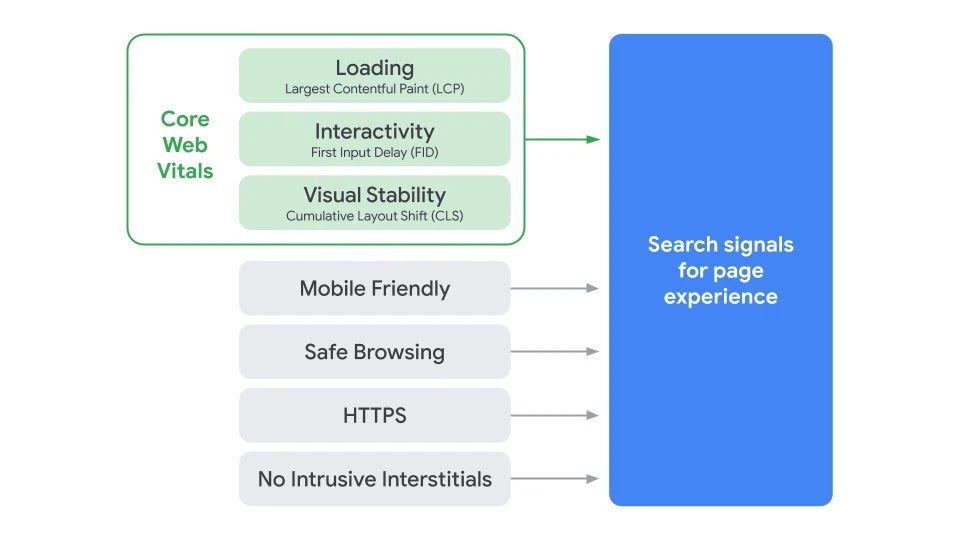
In the overall web-performance breakdown, Loading (Largest Contentful Paint), Interactivity (First Input Delay), and Visual Stability (Cumulative Layout Shift) make up the Core Web Vitals. These metrics are the driving point of including images and iframes on a website.
When you consider the stats showing that 90% of the information processed in the brain is visual, and with the same brain processing images 60,000 times faster than text, you understand that having images is good, and loading them fast is even better.
Lazy loading images on your website free up the additional content the browser must process before rendering your website in the user’s viewport. To better understand the importance of lazy loading images on your website, check out these three benefits:
1. Faster Page Load Time
Lazy loading images free up the number of HTTP requests the browser must make before fully loading the website. In addition, since the website isn’t loading the complete web page during page load events, the page’s weight stays light, allowing faster page load time.
2. Data and Bandwidth Conversation
The bandwidth of a website is highly dependent on the website’s content. In most cases, images and video are the highest data consumers for users visiting a website. Through lazy loading of your images, users’ data is only consumed based on the image they decide to see. This is good for users with slow or bad internet connections.
3. Reduction in Workload On The Server
The browser and the server communicate back and forth during the loading event to render a website. Therefore, the amount of content on the website is the same amount the browser will request from the server.
When there’s too much content to be processed by the server before sending it back to the browser, the server will likely have excess workload and deliver content later than usual. This is where lazy loading is the most beneficial, as it reduces the workload the server has to process simultaneously. Instead, the server only processes a request when the user makes one.
Now that we’ve discussed the three primary importance of lazy loading your images, next up is the techniques you can use to do the same.
Techniques Used To Lazy Load Images
There are two common techniques used for lazy loading images:
- The <img> tag
- The CSS “background” property
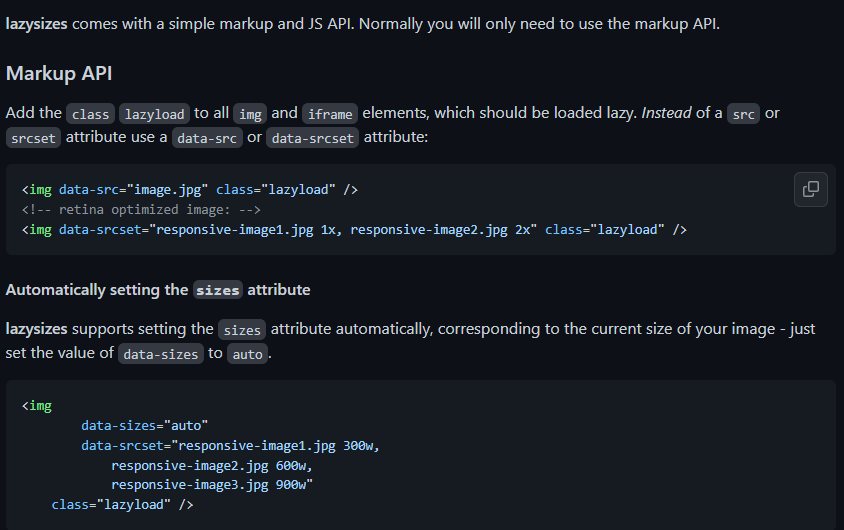
1. Lazy Loading With The <img> Tag
Loading with this technique is more of a general concept that takes up the typical HTML markup for an image:
<img src="/yourimagegoeshere.com/image.jpg" />
This markup is almost the same when lazy loading your images—except this time, you avoid loading the image upfront during the loading event. To do this, there are two steps:
- Tell the browser not to load the image upfront
- Tell the browser when to load the image
- Tell the browser not to load the image upfront
Common to many websites on the internet, sourcing for any image on a website uses the “src'' tag as its attribute. The browser uses this attribute to trigger the image load on a website wherever it is. So it doesn’t matter whether it’s above or below the fold in a user’s viewport or perhaps in the 10000th page of the HTML of your website. As long as the browser gets a hold of the src attribute, it’ll automatically trigger the image to load.
To defer the images from loading, put the image URL or source .upfront in any attribute other than src. A good way is to replace the main src attribute with data-src. Then, the browser won’t trigger the image to load if the src is empty.
<img data-src="/yourimagegoeshere.com/image.jpg" />
Now, we’ve told the browser not to load the images up front; we’ll move on to the second step.
- Tell the browser when to load the image.
Since we’ve deferred the browser from loading the image, aligning the image with the user’s viewport in order to trigger loading the image is next. For this, we’ll ensure that as soon as the image or, in some cases, placeholder enters the user’s viewport, it immediately triggers a load.
There are two methods to check when an image enters the user's viewport to do this.
First Method—Trigger Image Loading Using Javascript Events
Here, you use the event listeners in the browser—the scroll, resize, and orientationChange events.
- Scroll Event
This event estimates when the user has moved specific content corresponding to their viewport.
- Resize Event
With this event, the size of the browser changes from its default to the preferred size of the user.
- orientationChange Event
This event is related to how the user views the images in its viewport—usually in portrait or landscape. When users rotate their devices from portrait to landscape or vice versa, the number of images in the viewport will change. Doing this triggers the type of images the browser has to lazy load and also defer.
Using these events, you can easily detect a change in the user’s viewport, determine the images present and not present in the user’s screen, and load the appropriate images.
When either of the three events occurs, the first step is to find all the images you want to lazy load but aren’t loaded yet. Then, using the images you found, you check for the ones currently in the user’s viewport. Using the image’s top offset, the current document scroll top, and window height, you can do this.
- First Case scenario
If it has entered the user’s viewport, you pick the URL from the data-src attribute and put it in the src attribute, and the image loads as a result.
- Second Case Scenario
If the image is not in the user’s viewport yet, the image remains with the data-src attribute and doesn’t have to load.
Here’s an example.
Lazy loading images using event handlers—sample code
If you notice in the link above, the first three images are loaded up front. This is because the first three images are already in the user’s viewport; hence it’s in the src attribute instead of the data-src attribute—so no need to lazy load them.
Meanwhile, the images below are not yet in our viewport; once it gets to our viewport, the data-src attribute of the images is removed and replaced with the src attribute. So let’s move on to the second method.
Second Method—Trigger Image Loading Using The Intersection Observer API
The Intersection Observer API is a new API in browsers that takes the first method up a notch by avoiding the math and estimated guesswork. Instead, the API automatically makes it easy to detect when an image is in the viewport and when it’s supposed to take action.
Attaching an observer on all images to be lazy-loaded is an overview of how Intersection Observer API works. Once active, the API monitors all images and detects when it enters a user’s viewport. Then, using the isIntersecting property, you pick the image URL from the data-src attribute and move it to the src attribute—making the browser trigger an image load.
After this is done, the observer is removed or unattached from the image. Here’s a visual representation of how the Intersection Observer API works.
Lazy Loading Images Using Observer Intersection API—Sample Code
With both methods (Event Listeners vs. Intersection Observer API), loading time is essential for lazy loading images. However, the Intersection Observer API enables images to load faster and action the trigger more quickly.
This is hardly the case for event listeners, as in most cases, there was a need to include a timeout in the lazy loading of images to make the performance less sluggish.
Although Intersection Observer API is the apparent advantage, not all browsers can support it.
Currently, these are the only browsers and their versions supporting the use of Observer Intersection API:
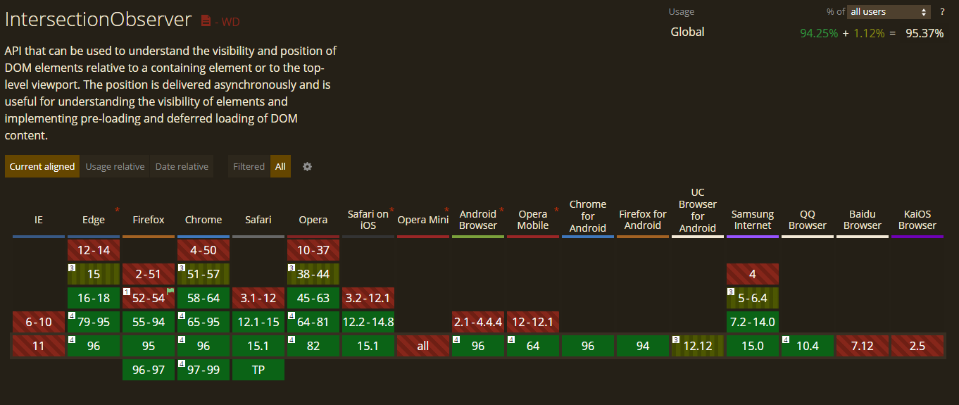
This data is from CanIUse.
As a result, most websites still use the event listener technique or, in some cases, use the two and interchange based on the user’s browser.
2. Lazy Loading Images With CSS “background” Property
In CSS, the common background image goes like this:
.my-class {
background—image: url (‘yourimagegoeshere.com/image.jpg’);
/* more styles */
}
But unlike with the <img> tag, CSS background images are not direct in their approach. Before the background image of the page loads, the browsers need to build the DOM (Document Object Model) tree and the CSSOM (CSS Object Model) tree to decide if the current CSS style applies to a DOM node in the present document. In this process, the outcome is one of two possible scenarios.
- First Case Scenario
If the CSS rule specifying the background image does not apply to an element in the document, the browser will not load the background image.
- Second Case Scenario
If the CSS rule specifying the background image applies to an element in the document, the browser loads the background image.
Although this might seem confusing at first, this is the same technique used in the traditional lazy loading images. The idea is simple: tell the browser not to apply a background image on the CSS property until the element comes into the user’s viewport.
Lazy Loading Images Using the CSS background Property—sample code.
Note: The CSS background property technique still contains the Javascript code used in lazy loading images. Also, the Observer Intersection API and the event listeners in the previous method are still active in this code. So, the only thing differentiating this technique is the difference in the CSS.
How To Improve User Experience When Lazing Loading Images
The concept of lazy loading images is based on improving the overall time it takes for images to render in users’ viewport. You may run a business that requires you to load many images—think photography or e-commerce brands.
These businesses constantly have to load many images on their websites, and lazy loading is best used. In addition, using it results in bandwidth reduction and other great benefits, as earlier discussed.
As much as lazy loading is beneficial for companies like this, there’s a common fear of the technique affecting user experience and even going as far as damaging server response time.
How do you improve a user’s experience while lazy loading images?
Below are best practices to improve user experience while lazy loading images.
1. Start With The Right Image Placeholders
An image placeholder is what you put in place of the original image until it loads. In most cases, placeholders can either be through:
- Dominant color
- Low-Quality Image Placeholder (LQIP)
Using a Dominant Color Image Placeholder
Every image you upload on your website comes with a predominant color; using this color as a placeholder improves user experience as it allows users to be familiar with what to expect when the image finally loads.
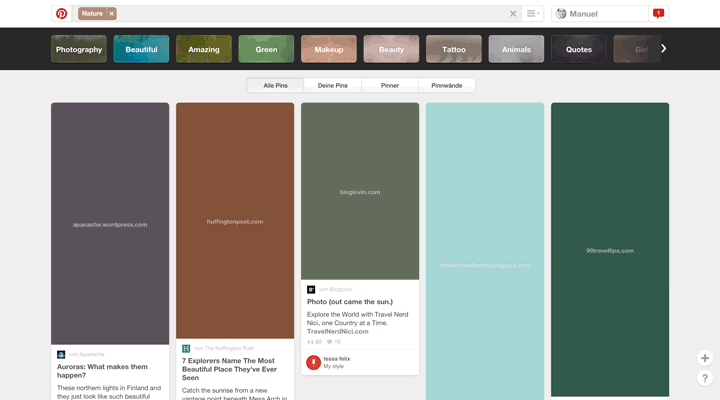
Here’s an example from Manu.ninja (Source: Imagekit.io)
Using Low-Quality Image Placeholder (LQIP)
This type of placeholder uses a lower quality or, in most cases, the blurred version of the original image as the placeholder. This is the preferred choice for most brands displaying many images for their users. The concept of the blurred version of the original image allows users to get a sneak-peek of what to expect. When the image loads, it’s simply a clearer version of what they’ve already seen.
This technique is used by companies such as Medium, Facebook and Unsplash, as seen earlier.
Placeholders are used to ease users into the transition of the actual image instead of merely letting it pop up when it’s in their viewport.
2. Avoid Image Shifting During Load Event
During the initial loading event, the browser doesn’t know the image’s size, height, and width about to render. When this image is seen on the main thread about to be computed, the browser automatically fits the size based on the user’s current device.

Due to this change, the image does not have its initial size and will, in most cases, continue to shift the more the page loads. This type of event is measured using the Cumulative Layout Shift metric that measures how visually stable a web page is during page load. If the images on the web page move too much, the user experience gets affected.
However, there’s a solution to this problem. Simply specify the dimensions of all images on your web page. By specifying the image’s height and width, the browser already knows what type of image is about to render, so when the image loads, it fits perfectly into the allocated size without shifting.
3. Don’t Lazy Load All Images
You want to improve your page load time, but lazy loading your images to achieve that will inadvertently affect your user experience. When you lazy load images, you delay the loading of the asset until it comes to the user's viewport. In a scenario where you lazy load all images, including those above the fold, images won’t immediately load when your website loads. It’ll take a few seconds.
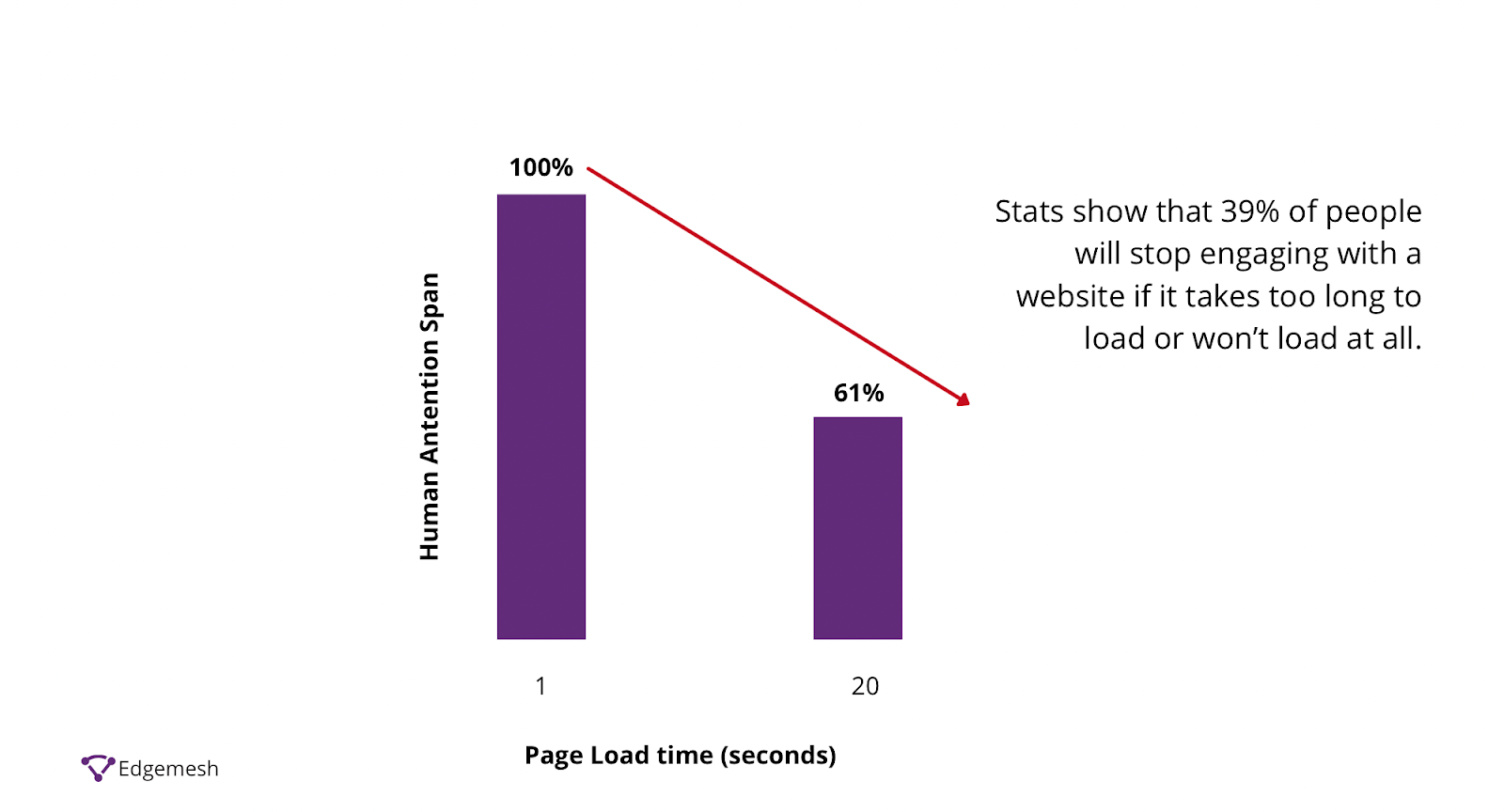
Within those few extra seconds, 40% of your users will most likely bounce based on the assumption that your website isn’t working because they were left with a blank screen.
Here are two principles to follow when you lazy load images.
- Don’t Lazy Load Images Above The Fold.
Images above the fold will be in the user’s viewport, so lazy loading makes no sense. This includes images in your marketing banners, hero images, logos, etc. Do not lazy load any of them.
If above-the-fold images affect your page load time, compress them in the best possible way or opt for something related that consumes less power and bandwidth. As long as the image is in the user’s viewport or perhaps slightly off, don’t lazy load this type of image.
- Don’t Lazy Load Images On Short Pages or Low Amount of Images.
If the image you plan to lazy load is a short page that takes just a single scroll to get to the bottom, there’s no point in lazy loading these. Also, if fewer than 3-5 images are on the whole page, don’t lazy load them.
Javascript Libraries to Lazy Load Your Images
Although similar in all techniques, the implementation of lazy loading images can vary depending on your browser or device. To make the best choice in lazy loading your images, here are some Javascript libraries that can help.
General Libraries
Yet Another Lazy Loader (yall.js)
This library uses the observer intersection API in lazy loading images—and also uses event-listeners for browsers that don’t already support Observer Intersection API. Although this works for any HTML element, this, unfortunately, does not work on background images in CSS.
This library is popular due to its extensive functionality. One of its features includes support for responsive image srcset and sizes attribute. In addition, it doesn’t use the Observer Intersection API, so most browsers widely accept it.
Libraries for Specific CMS
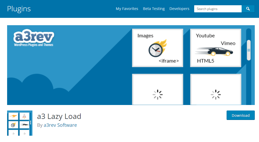
WordPress A3 Lazy Load
This comes as a plugin available in WordPress to help users lazy load their images. Although WordPress is home to hundreds of lazy loading plugins, the A3 lazy load is different due to its Javascript fallback feature. This feature optimizes images when Javascript is unavailable.
Welt Pixel Lazy Loading Enhanced

This is a Magento 2 extension that aids lazy load images of websites powered by the Magento CMS, specifically e-commerce brands.

This Shopify plugin allows you lazy load images of websites powered by Shopify.
Final Thoughts
And that’s all you need to get started with lazy loading your images. Of course, implementing all or some of the methods and techniques in this article will improve your overall performance.
Want more? Here are some additional articles on speeding up your website’s overall performance.
- Complete Guide On Time To First Byte (TTFB)?
- Complete Guide On First Contentful Paint (FCP)?
- All You Need To Know About Total Blocking Time (TTB)
- What Is Start Render Time, and How Do You Improve It?
- The Complete Guide To Google’s Core Web Vitals: What is Largest Contentful Paint (LCP)?
Do customer experience, good conversions, low bounce rates and overall, speed matter to you? Then you’ll love Edgemesh’s Enterprise-Grade Web Acceleration.
Our intelligent, automated, and next-generation client-side caching readies your website to move at full speed—with just a single line of code. Plus, it takes under 5 minutes to set up.
What do you say?
Start your 14-day trial to get a feel for what speed means to your business.


