What are render blocking resources?
Render blocking resources are pieces of bit-sized code in JavaScript, and CSS files that block the rendering of a web page.
According to Google’s Lighthouse;
The <script> tag is render-blocking when:
- It’s in the <head> element of the document.
- It does not have a <defer> attribute.
- It does not have an <async> attribute.
Also, the <link rel=“stylesheet”> is render-blocking when:
- It does not have a <disabled> attribute.
- It has a <media=all> attribute that doesn’t match the user’s device.
To make all of this simple, here’s how it works:
During the page load, the browser connects to the website’s server to download the requested page and its resources. Some of the resources that make up this page include HTML, CSS, and JavaScript.
The HTML resources are plain text documents that can be parsed and executed by the browser. However, the styling function of this website is powered by the CSS — and the interactivity is powered by JavaScript.
While these JavaScript and CSS resources are important for the website, when poorly optimized, they affect the successful loading of the website.
For instance, when the browser encounters some redundant JavaScript or CSS file, it must parse, and execute the files before rendering other parts of the page. When this is going on, the user will either see a blank screen or are unable to interact with the website — hence, the term, “render-blocking resources.”
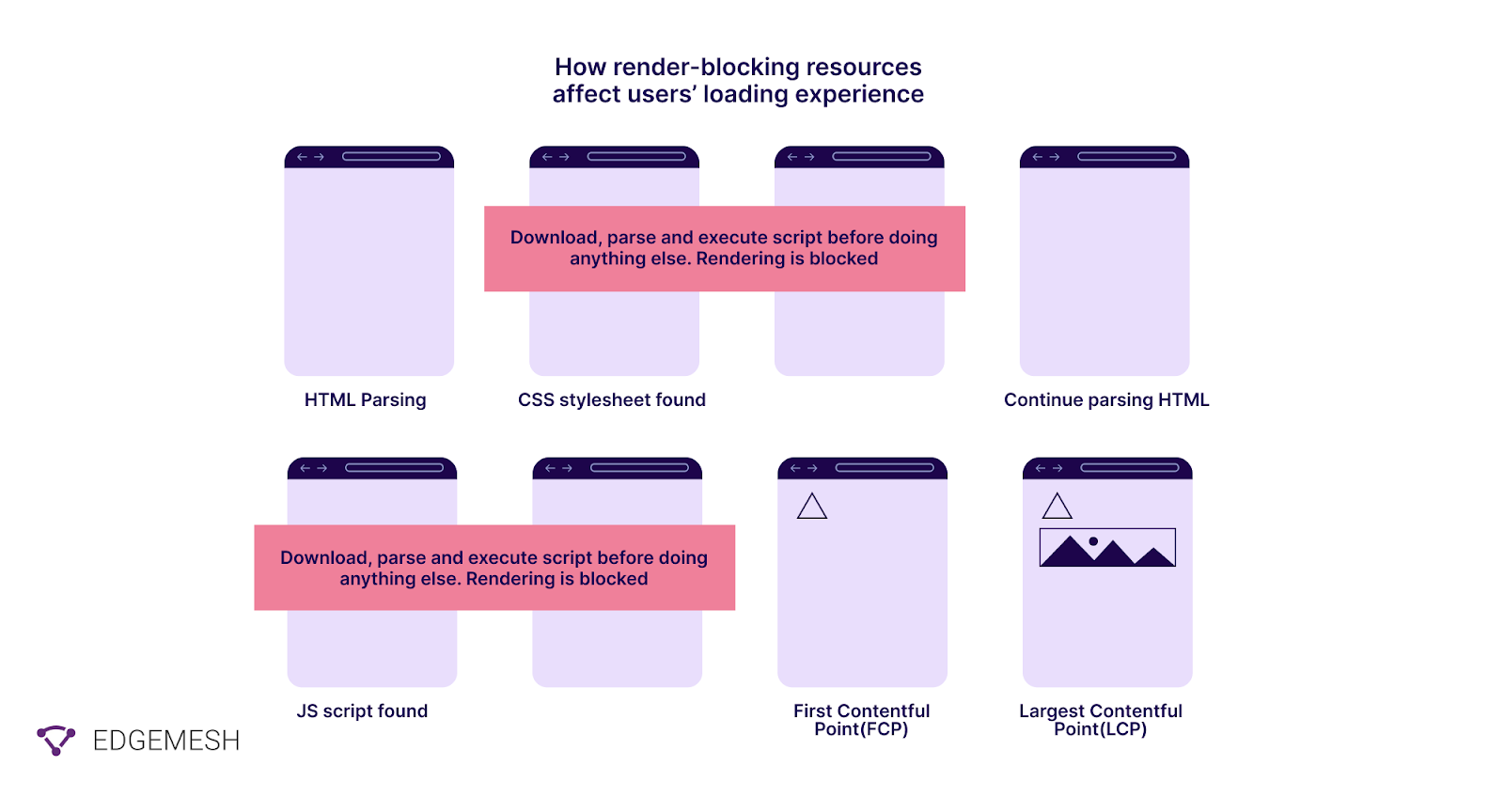
In a broader context, for us to understand render-blocking resources, we need to break down the critical rendering path.
Related → Third Party Tags: How They Affect Overall Website Performance.
What is the critical rendering path?
The critical rendering path is all the steps the browsers have to take in order to render a web page. This means the process of converting HTML, CSS, and JavaScript files into pixels on the screen.
How does the critical rendering path work?
In general, the critical rendering path includes the Document Object Model (DOM), CSS Object Model (CSSOM), render tree and layout.
Here’s how it works:
- First, the DOM is created as the HTML is parsed.
- Depending on the structure of the page, the HTML file might request for JavaScript. When this happens, it alters the DOM.
- Next, the HTML requests for styles which in turn builds the CSS object model.
- The user browser combines the two to create the Render Tree.
- Lastly, the layout determines the size and position of every element on the page — after which, pixels (or web page) are rendered on the screen.

What makes all this important?
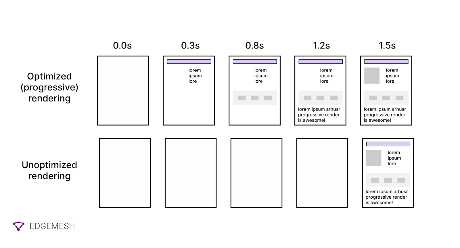
Well, for the most part, the critical path determines how fast your web page renders for the user. As a result, it’s important to optimize this path so users can get to the First Paint as quickly as possible.
Related → 5 Ways to Optimize Third-Party Scripts (And Easier Solutions)
Why should you eliminate render blocking resources?
In simple words — to make your website faster.
It’s a general knowledge that fast websites help you generate more traffic and increase revenue— and slow sites do the opposite.
Take a look at this stats:
- A 1-second speed improvement can increase mobile conversion by 27% [*].
- Conversion rates are 3x higher for e-commerce websites that load in 1-second [*].
- Large media sites lose 10% of their users for every additional second it takes their page to load [*].
In a nutshell, speed is important in every aspect of your website. And having render-blocking resources will only slow down your website which in turn affect your revenue, rankings, and traffic.
Related → What is page speed? [+Why it’s important for SEO]
What are the indicators of render blocking resources?
There are three performance indicators that lets you know your website has render-blocking resources:
- Largest Contentful Paint (LCP): This metric measures how long for the main content or largest block element to render in the user’s viewport. The LCP is responsible for 25% of your page performance.
To measure this, you have to compare your LCP score with the recommended score.
Ideally, any LCP of a website below or equal to 2.5s is considered good.
- If it’s below or equal to 4s — Needs improvement.
- If it’s higher than 4s — Poor.

- Total Blocking Time (TBT): The TBT measures a web page’s unresponsiveness to user input during loading and accounts for 30% of your website’s total performance, according to Lighthouse v.10.

What’s a good total blocking time?
A good total blocking time is anything below 300ms
- If it falls within 300 to 600 ms, there’s a need to improve
- A total blocking time above 600 ms is poor and needs to be addressed immediately.
- First Contentful Paint (FCP): The FCP is a user-centric metric that measures the time it takes the browser to render the first piece of DOM content (SVG, image (including background images), text, or non-white canvas) on a page.

According to Lighthouse, the FCP accounts for 10% of your overall page performance.
In determining your FCP, Google compares your FCP times with real websites.
- Good — 0 seconds to 1.8 seconds
- Needs improvement — 1.8 seconds and 3 seconds
- Poor — 3 seconds and above
With these three indicators having a combined percentage of 65% on your page performance, it’s obvious that removing render-blocking resources is important in speeding up your website.
Suggested reads:
- What is Time to Interactive (TTI)? [+How to improve].
- What is First Input Delay (FID)? [+How to improve].
- What is Cumulative Layout Shift (CLS)?
How to find render blocking resources?
You can use various tools to identify render-blocking resources. But here, we’ll be focusing on and recommending two tools; PageSpeed Insights, and WebpageTest.
Using PageSpeed Insights to find render blocking resources
- Visit PageSpeed Insights
- Input your website address and click on analyze.
The result is what you’ll get below:

- Scroll down to the “opportunities” section to review the files blocking your website from rendering. Meanwhile, if you passed it (like we did below), you’ll see it in the “passed audits” section.

Using WebPageTest to identify render blocking resources
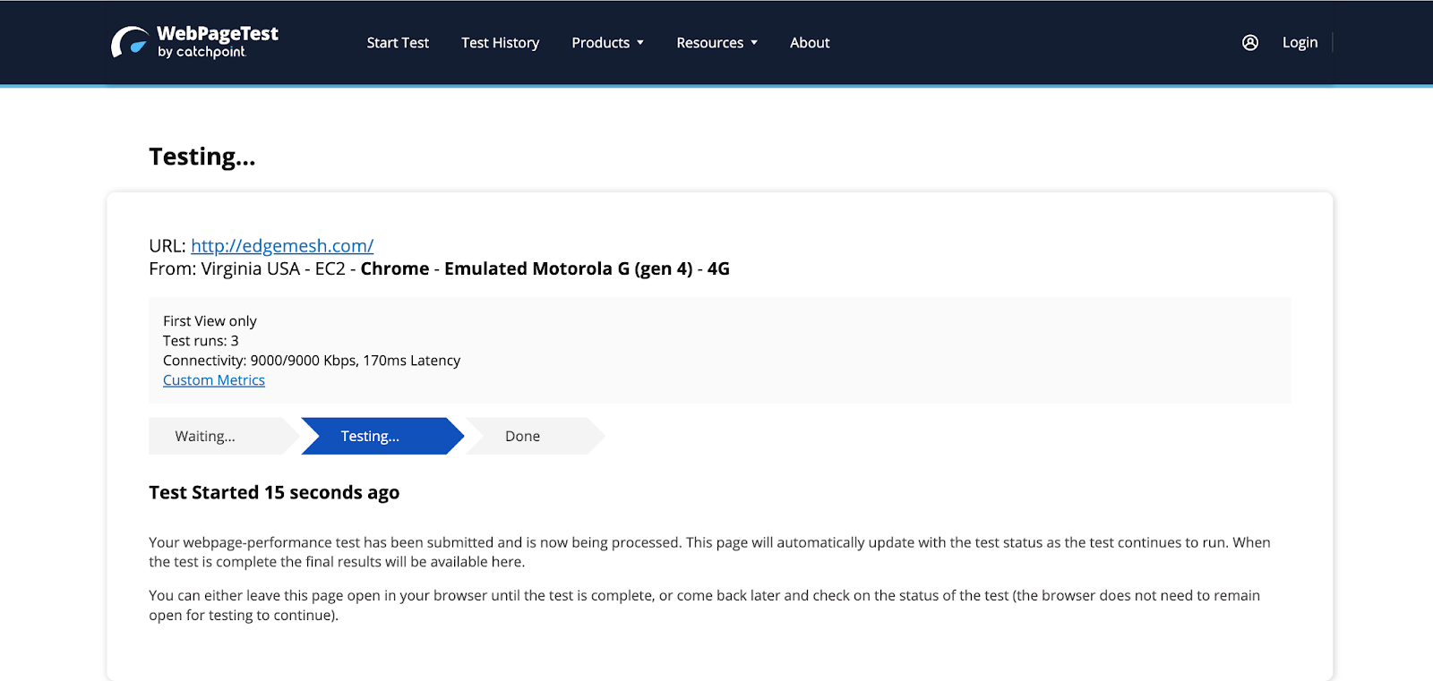
- Visit WebPageTest
- Input your website address and click on “Start Test.”
- The tool will do three test runs on your website.
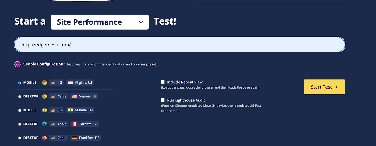
- Scroll down and click on the “Waterfall view”
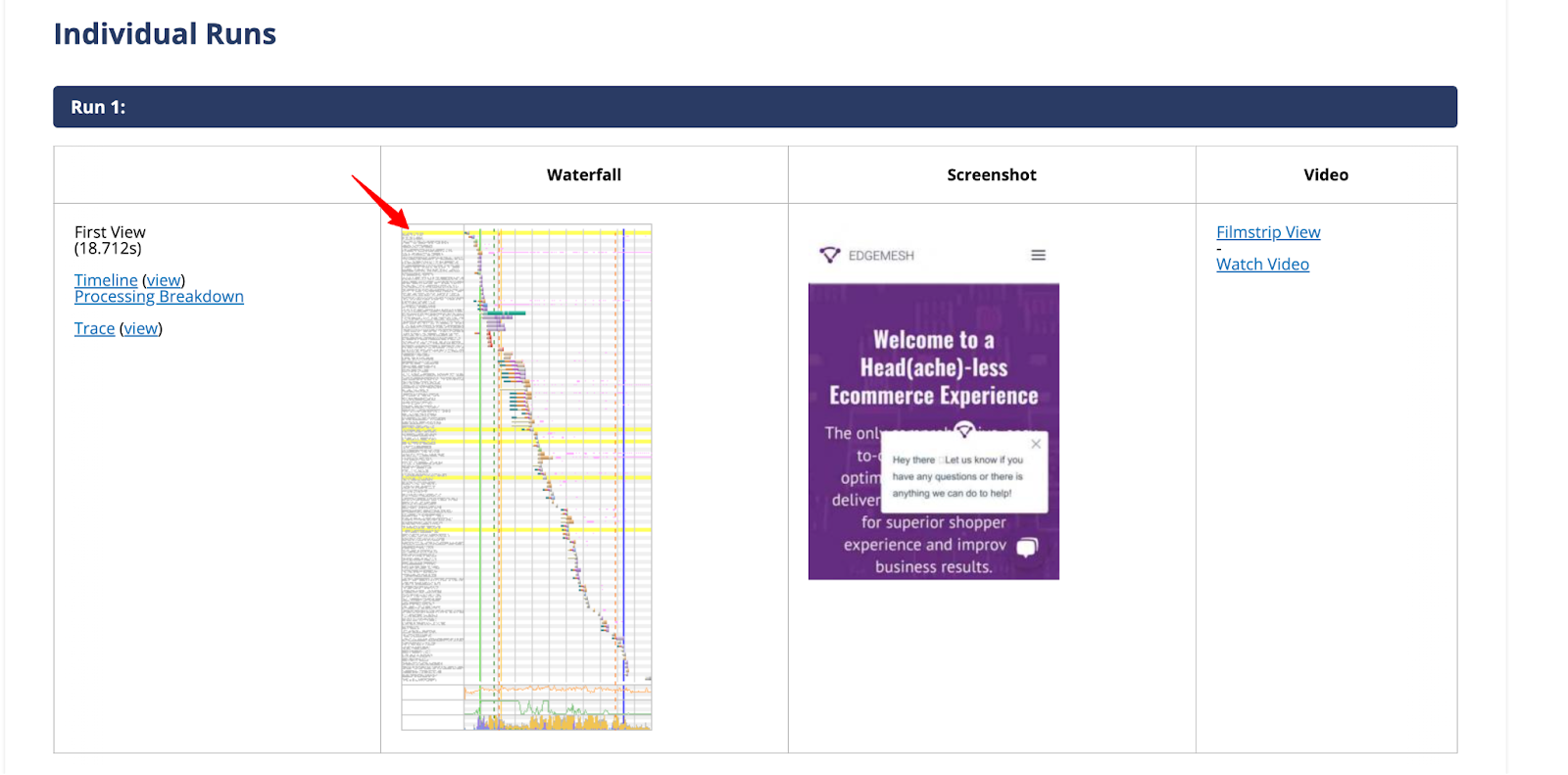
- The render blocking resources are marked with “X” — and when you click it, you’ll get a breakdown of its status including the file responsible.

Now that you’ve figured out the JavaScript and CSS files affecting your website performance, next is to eliminate them.
How do you eliminate render-blocking resources?
For the most part, render-blocking resources come in either CSS or JavaScript files. So, if you’re doing it manually (without plugins), there’s no “one-fix-all” solution. Rather, you’ll eliminate the resources separately.
How to eliminate render-blocking CSS resources
As said earlier, CSS is responsible for the styling (all the colors you see) on your website. While that might look simple, it might be tricky to fix.
1. Inline critical CSS
Inclining critical CSS simply refers to inserting the CSS code directly into the HTML file — rather than loading it separately.
Now, the “critical CSS” part is one required to render above-the-fold content (content users see without scrolling). By inlining this critical CSS, the browser can render the above-fold-content more quickly without necessarily waiting for external CSS files to load.
To inline critical CSS, you need to first identify the CSS rules responsible for rendering your above-the-fold content. Once you have identified this, copy the code and paste it directly into the HTML file between the <style> tags in the <head> section.
Here’s an example of a typical HTML file referring to an external CSS (mystyle.css) file:

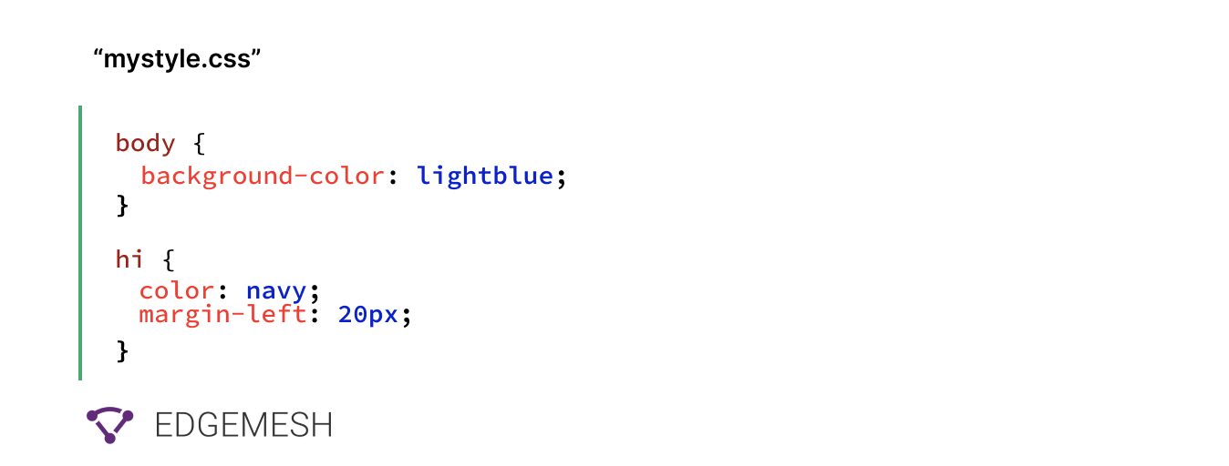
Here’s how it’ll look when it’s inlined:

It’s important to also note that inlining your CSS can increase your HTML file size, which can slow down your website’s loading time. This is why it’s recommended to only inline critical CSS, and load the remaining CSS file as an external file.
2. Use media queries to load non-critical CSS (conditional CSS)
This is taking on from inlining critical CSS. With the <media> queries, you can customize different styles for different screen sizes. However, this is only applicable for non-critical CSS.
To implement this, you need to identify the CSS required to load below-the-fold content. After which you group them into logical sections based on the content of the page and load them using separate media queries.
For example, you can use a media query to load a separate screen size for mobile devices, print and desktop. By doing this, you reduce the file size of the CSS that needs to be loaded. This also means, on devices where they’re conditional (not requested) it gets skipped, and only the requested screen size gets rendered.
<link href="print.css" rel="stylesheet" media="print">
<link href="large.css" rel="stylesheet" media="screen and (min-width: 1500px)">
<link href="mobile.css" rel="stylesheet" media="screen and (max-width: 600px)">
Related → How to serve images in next-gen format [Guide]
3. Minify your CSS
To minify your CSS simply means removing unused characters (& unnecessary) characters in your CSS code without affecting its functionality. Some of these characters include whitespaces, spaces, tabs, line breaks and comments.
Here’s an example below:

The primary goal of this minification is to reduce the size of your CSS files so the browser can download and parse it faster.
Some popular tools available include:
How to eliminate render-blocking JavaScript resources
Majority of the resources blocking your website are JavaScript resources. This is because JavaScript can modify the DOM and CSSOM, which can cause the browser to recalculate the layout, content type, and even restyle the page— hence, causing delay in rendering.
For example, if a JavaScript function on your website adds an image to your website or changes its dimensions, the browser must first calculate the layout and all other JavaScript tasks before it renders the complete page.
To minimize this, you have to use two techniques called asynchronous loading <async> and deferred execution <defer>.
The async and defer attributes help you delay the loading of JavaScript on a website. Basically, making the scripts non-blocking so the browser can parse the HTML without interruption.

Using Async Attribute
The async attribute tells the browser to continue parsing the HTML while the script downloads in the background. Once the script is downloaded, the browser halts the HTML parsing and executes the script.

💡Pro Tip → Use the async attribute to only load scripts that contribute to the immediate functioning of your website.
Using Defer Attribute
The defer attribute instructs the browser to finish parsing the HTML before executing the JavaScript. This lets the browser build the DOM and fully render the page to the user before.
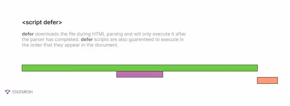
However, this can make the website unresponsive to the user’s input for the first few seconds.
💡Pro Tip → Defer all scripts that are below the fold or that are non-critical to the website’s performance.
Related → How to remove unused JavaScript from my website?
Eliminate Render blocking resources with Edgemesh
Edgemesh implements the fastest render-blocking headless solution in the market for your website. With a simple line of code — that you can do yourself — Edgemesh connects your website to our edge network with several servers spread across different regions. So it doesn’t matter where your users are, your website still loads fast.
In addition to improving website performance, Edgemesh offers a range of other features to help optimize your website, such as client-side caching, compression, and a head(ache)less framework.
Forget costly, complex and time-consuming changes to pages, workflows or platforms. With Edgemesh you get the performance of headless without the headache.
Trying to eliminate render blocking resources? Try Edgemesh today.


